

Last year when the football jerseys were revealed, there were cries along the lines of “Where’s the Orange??” Many fans, myself included, were disappointed by the uniforms that were revealed last April. Why did the numbers look this way? Why is there a gray option? Why revamp the jerseys? Those are the kind of questions that flew around in the comments below the articles.
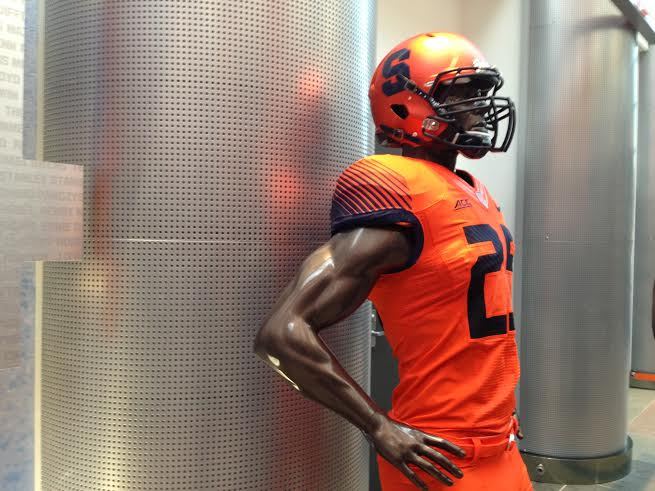
Now, just this week, Syracuse Athletics revealed the uniform we were waiting for, the Orange jersey with blue pants. And they looked solid, considering they were the same design as the jerseys revealed last year but in another color. That was great, until the next day when this picture turned up from the football building at Manley, which brought back memories of this disaster against Washington nearly 8 years ago.
But here is the thing, no matter what Syracuse does right now regarding jerseys, fans are going to be upset with what it chooses. Last year, it was not evident that Syracuse’s nickname was the Orange. This year the Orange uniforms are “too orange” or ugly.
Bringing change to anything is a lose-lose situation. On one hand, we don’t like the idea of what Nike is doing in changing the nickname—Orangemen to Orange—then taking total control of the uniform process. On the other, we don’t like change. We want to keep living in the glory days of Syracuse football where the team looked and played a certain way, it is part of the reason we don’t like the direction the team has headed the past couple years.
No matter what Syracuse athletics did regarding jerseys, there was going to be an outcry from fans and media because it is different. They may not be what we want them to be, but they bring the program further into the present age of college football. Now, uniforms are all about the ability to mix and match and “look cool” to recruits. These uniforms do a much better job of that than the old ones. And to be honest, the Orange set just helps the program with more variability.
So it seems like an inevitability that September 26th against LSU, Syracuse will run out of the tunnel covered head to toe in Orange. It may look ugly, but it is all in the name of recruiting and advancing the program.
And if we hate the change in the uniforms, imagine how bad the reaction will be when the Dome is changed or demolished in the near future.
Posted:  Seth Goldberg











4 responses to “New Orange Jersey’s a Lose-Lose for Syracuse Football”
Billy Crystal in some Saturday Night Live skits had that character “Fernando”…”you look mahvelous!”
“And it’s better to look good than to feel good……”
Welcome to SU’s encounter with new football uniforms. SU football since the late days of Coach P has been weak at best…I’m being kind here.
So instead of putting $$$ into fixing the program and restoring it to the success of the late 80s and 90s, we “painted over” the rotting wood with new unis. Who could forget the prison-like jumpsuits of the GROB era? SO in order to be “interesting”(for a couple of weeks) and to look cool for recruits we jettison tradition. And we have been rewarded with recruiting classes right around 50th. If looking cool was high on the radar of recruits, how is it Alabama, Fla st et al rake in superior recruiting classes while Oregon(who is cooler than the Ducks) came in around 20th in 2015? Other than the all whites, SU’s uniforms have been a joke…kind of like the team.
Is it “better to look good than to PLAY good?”
I’m not a fan of the ‘electric tangerine’ uniforms.
Short and sweet. I can’t stand when people write paragraphs in comment sections. I get what you’re saying with the headline. Some people think that way. But to me, I love every thing the Program is doing with branding, and The new uniforms are sick. It’s about time we had a all Orange Uniform. Some people get it.
I dont mind the All Orange Everything jerseys but the blue pants def look better. I dont have a problem with updating the look, but its kinda hard to make Orange work I guess. They should probably reserve the all orange look for Sr. day or something.